Successfully graphed both test targets and graphed the PCA waterband depth plot
I have successfully moved forward with several things on my to do list. First off I have successfully graphed both test targets after reducing them. I extracted them with an extraction width of 7. We can change this to match the Apai paper. I did this by copying one of the regular star location images, since the code wanted at least 2 star location images. The code then ran perfectly fine after reduction on all the test target data.
I have also taken Dylan's PCA code, modified it somewhat, and have used it successfully to graph a waterband depth plot for the 2 test targets and the 2 targets I'm working on. I just used an array of 1's to calculate the error since I have not learned how to calculate the error for a pca plot.
The test data does not perfectly match our data, but that is most likely because the parameters used to extract the data using aXe are not exactly the same, as well as the systematic errors are not accounted for in the test data. However the variation of both is within reason if you take into account that systematic errors have not been corrected, showing that our methods are good compared to Apai. In the Apai paper J2139 amplitude was 27% and SIMPO0136 amplitude was 4.5%. In the plots I've made I get 23% amplitude for J2139 and 4.8% amplitude for SIMPO0136. This is around 15% different for J2139 and 6% for SIMPO0136. I have placed graphs of the test data along with our data below.
2MASSJ2139


SIMP0136


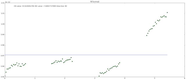
SDSS-J075840.33+324723.4


2MASS-J16291840+0335371

I have also taken Dylan's PCA code, modified it somewhat, and have used it successfully to graph a waterband depth plot for the 2 test targets and the 2 targets I'm working on. I just used an array of 1's to calculate the error since I have not learned how to calculate the error for a pca plot.
The test data does not perfectly match our data, but that is most likely because the parameters used to extract the data using aXe are not exactly the same, as well as the systematic errors are not accounted for in the test data. However the variation of both is within reason if you take into account that systematic errors have not been corrected, showing that our methods are good compared to Apai. In the Apai paper J2139 amplitude was 27% and SIMPO0136 amplitude was 4.5%. In the plots I've made I get 23% amplitude for J2139 and 4.8% amplitude for SIMPO0136. This is around 15% different for J2139 and 6% for SIMPO0136. I have placed graphs of the test data along with our data below.
2MASSJ2139


SIMP0136


SDSS-J075840.33+324723.4


2MASS-J16291840+0335371


Comments
Post a Comment