working on the waterband graphs
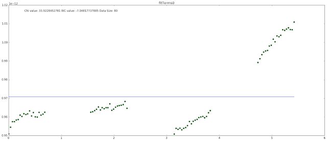
Today I found something interesting playing around with the test data. I found that when graphing just the raw data, I got a very noisy looking graph with only a sort of dip in the waterband. I thought this was strange, especially since in the paper they have a very clear dip in the waterband. Through some experimenting I found that using a rolling mean to smooth out the data, I produced nearly the exact same graph as was produced in the paper, with the same type of features in the waterband. I then did this same thing on the data that we have and produced a much cleaner and clear signal than what we had before. I included the test data and the data we are currently working with as well. The smoothing I think brings out a better waterband feature for both test targets that we have been working with.
SIMP0136


2MASS-J16291840


SDSS-J075


SIMP0136


2MASS-J16291840


SDSS-J075


Comments
Post a Comment